ADA Compliant
With years of experience, Ad Art can deliver ADA (American Disabilities Act) Compliant industry standard signage with unique design attention.


What is ADA Compliant Signage?
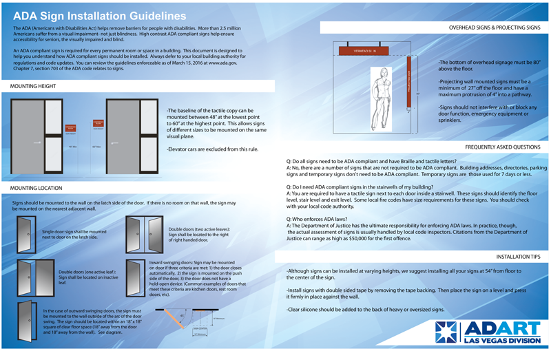
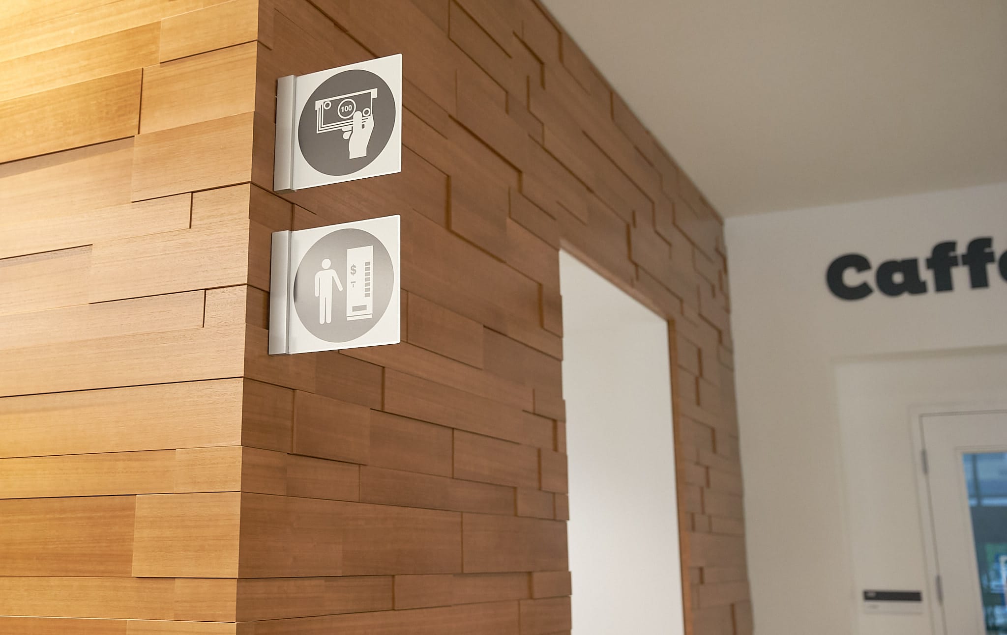
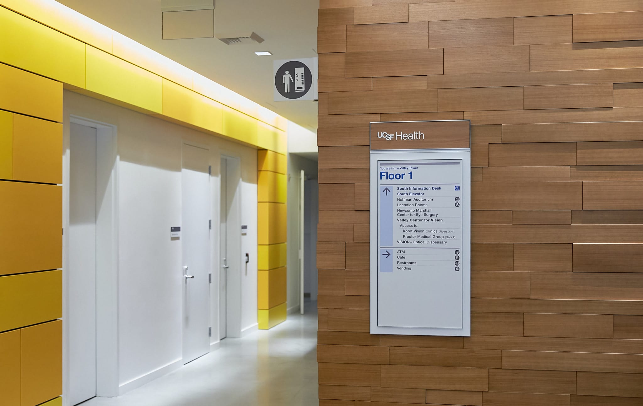
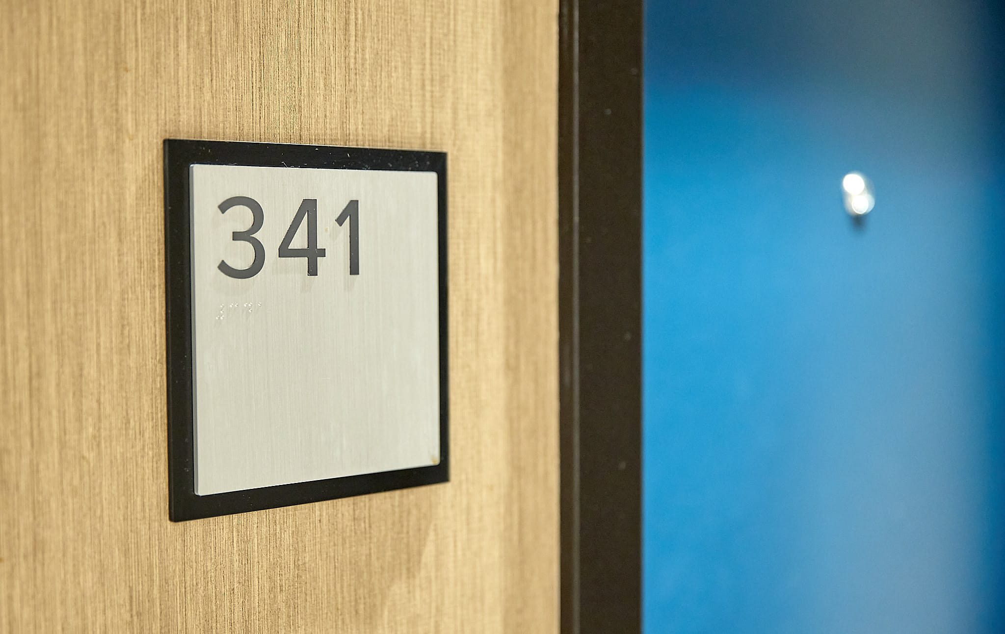
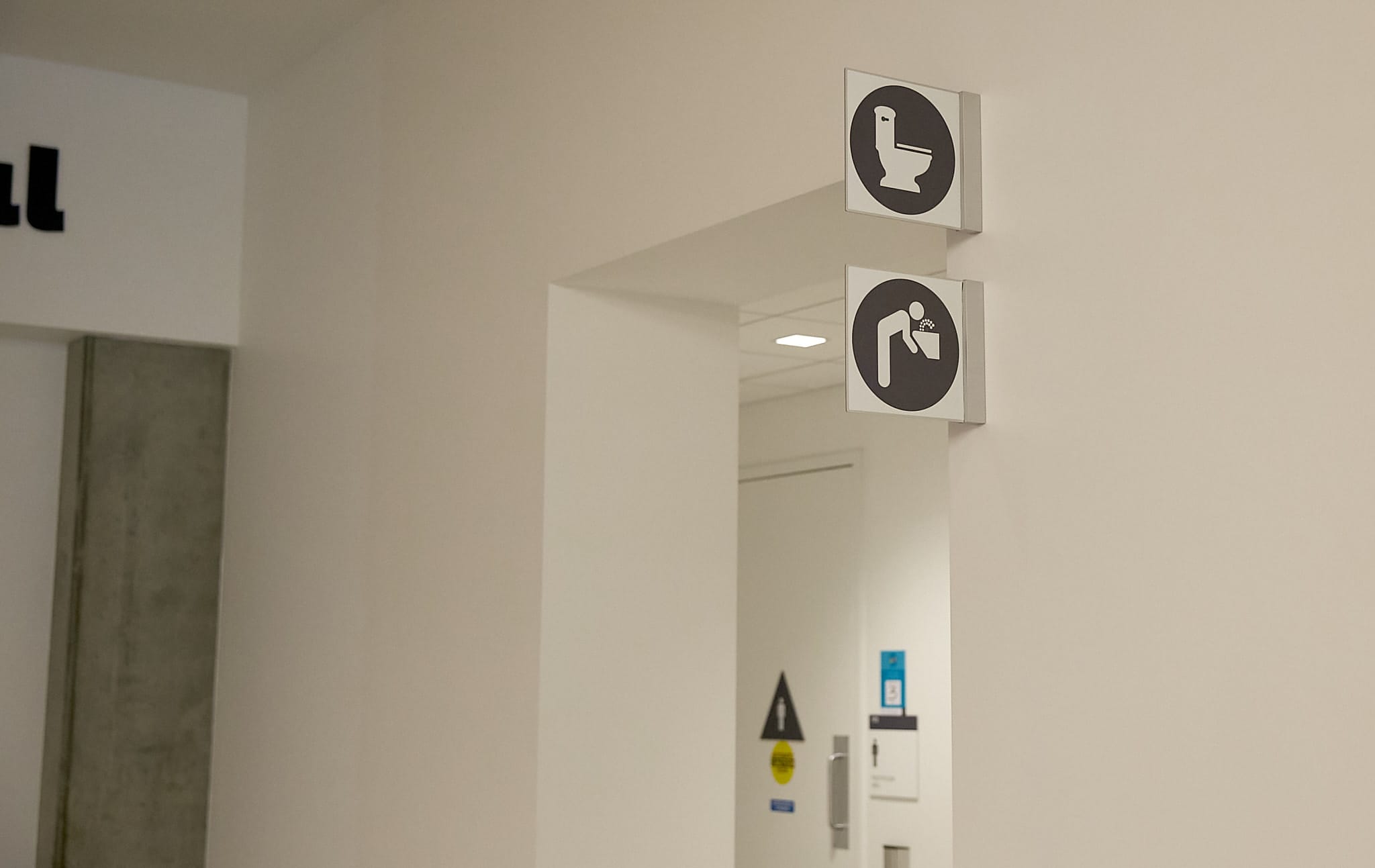
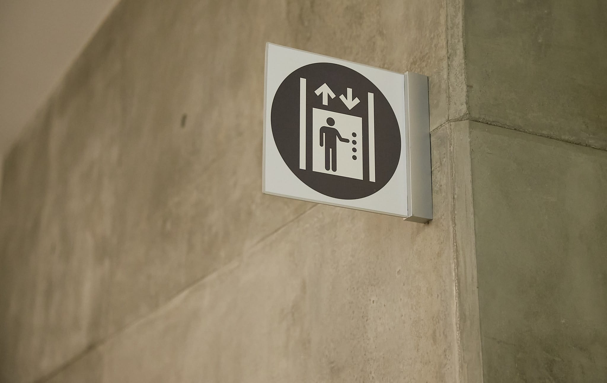
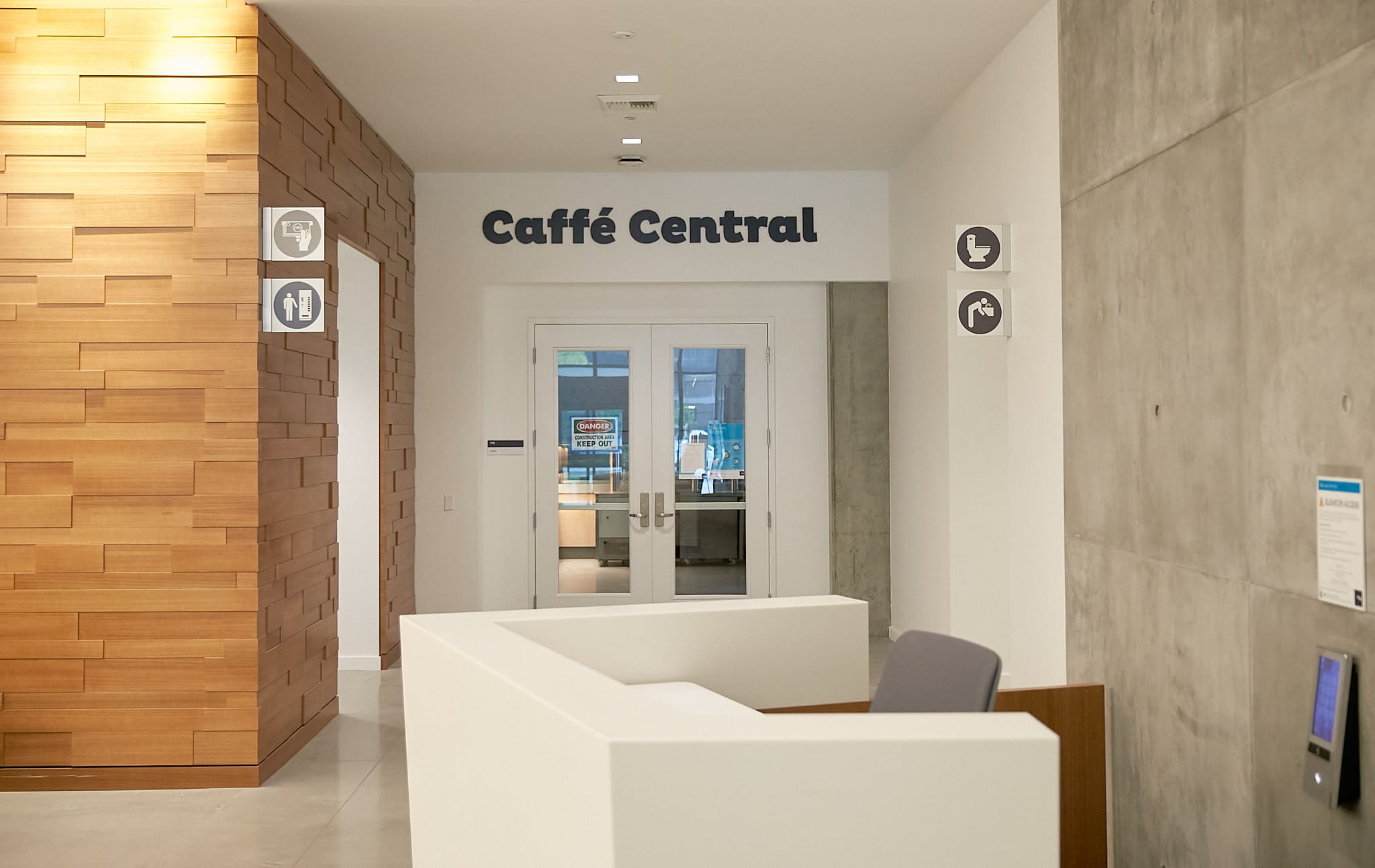
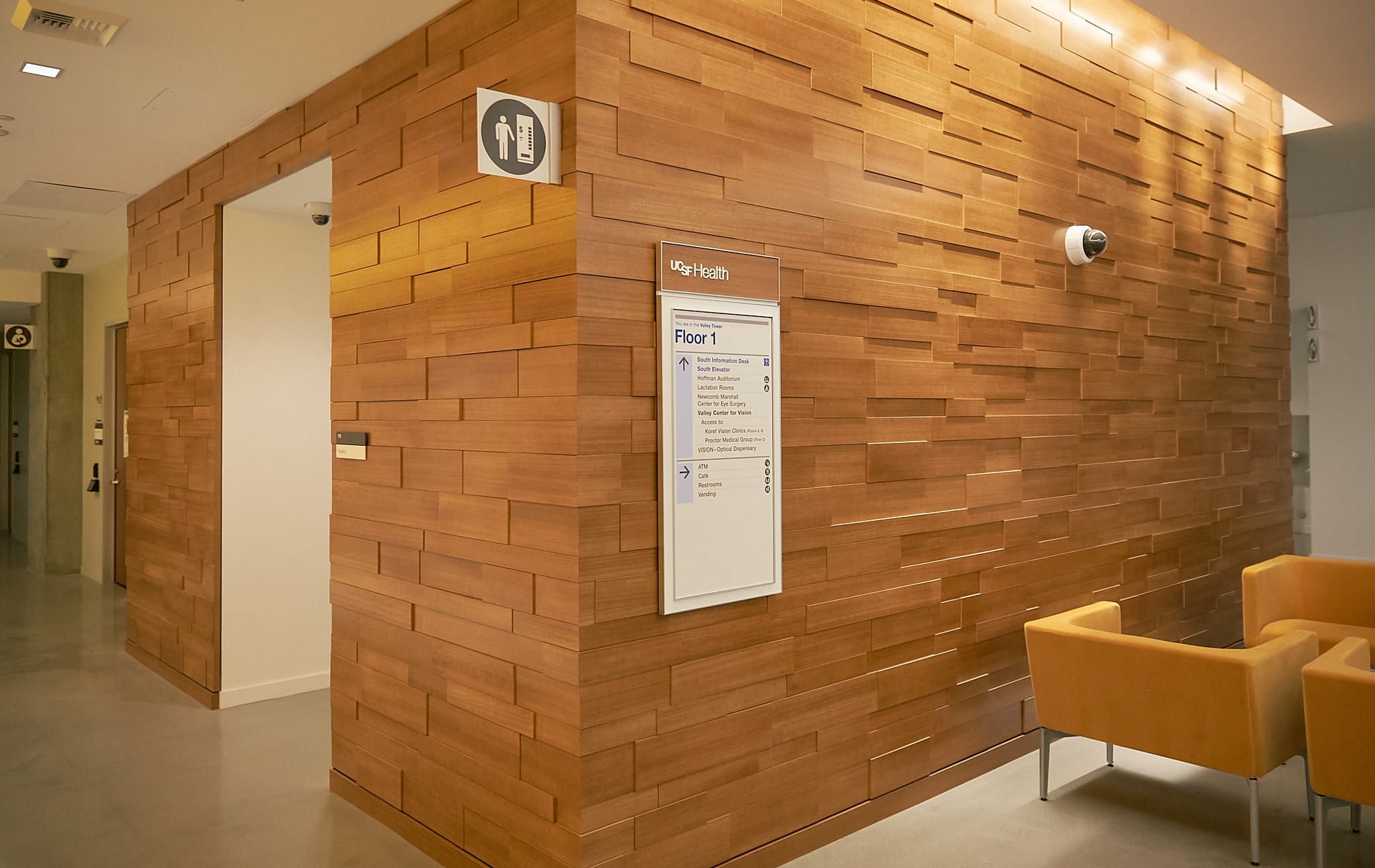
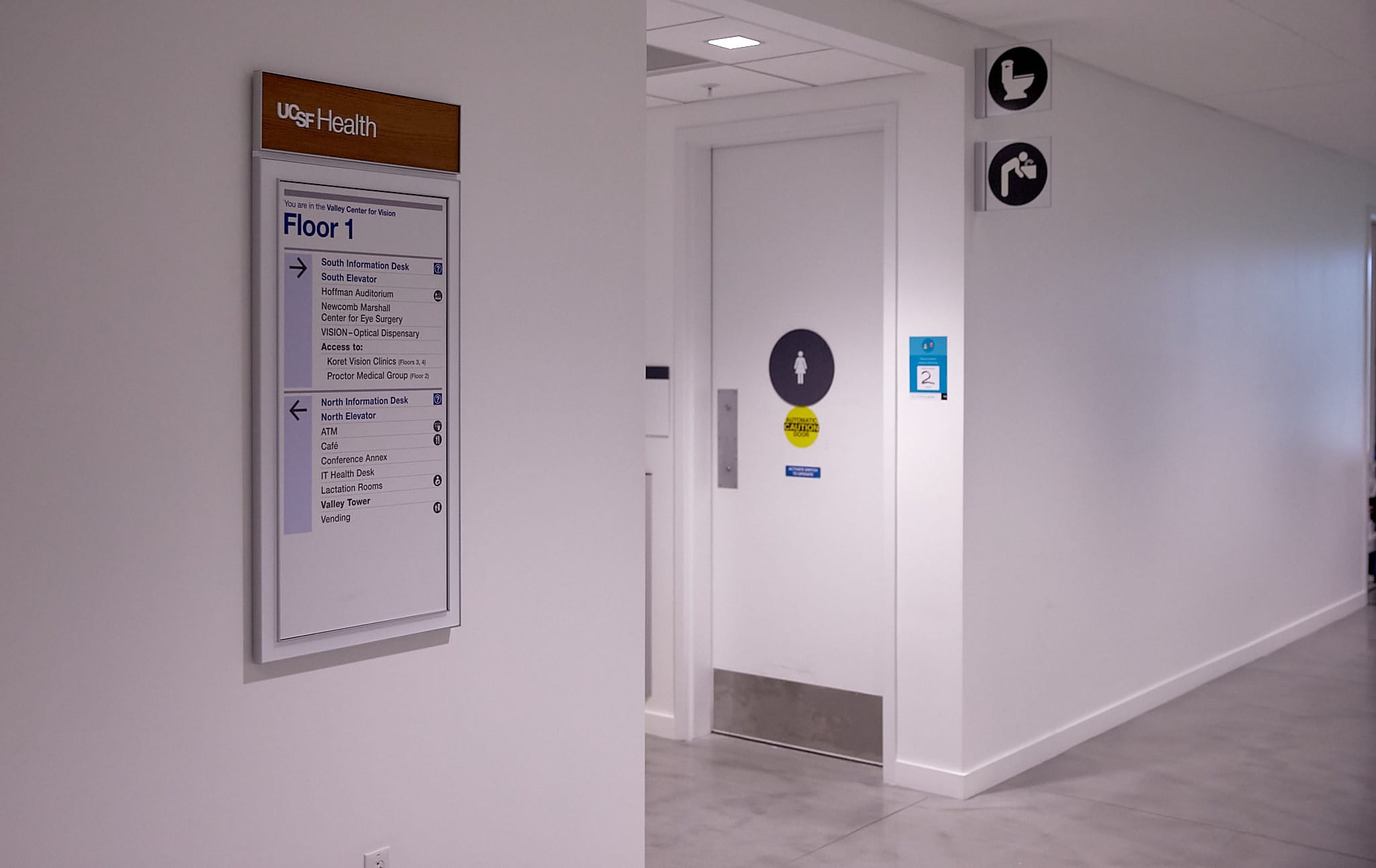
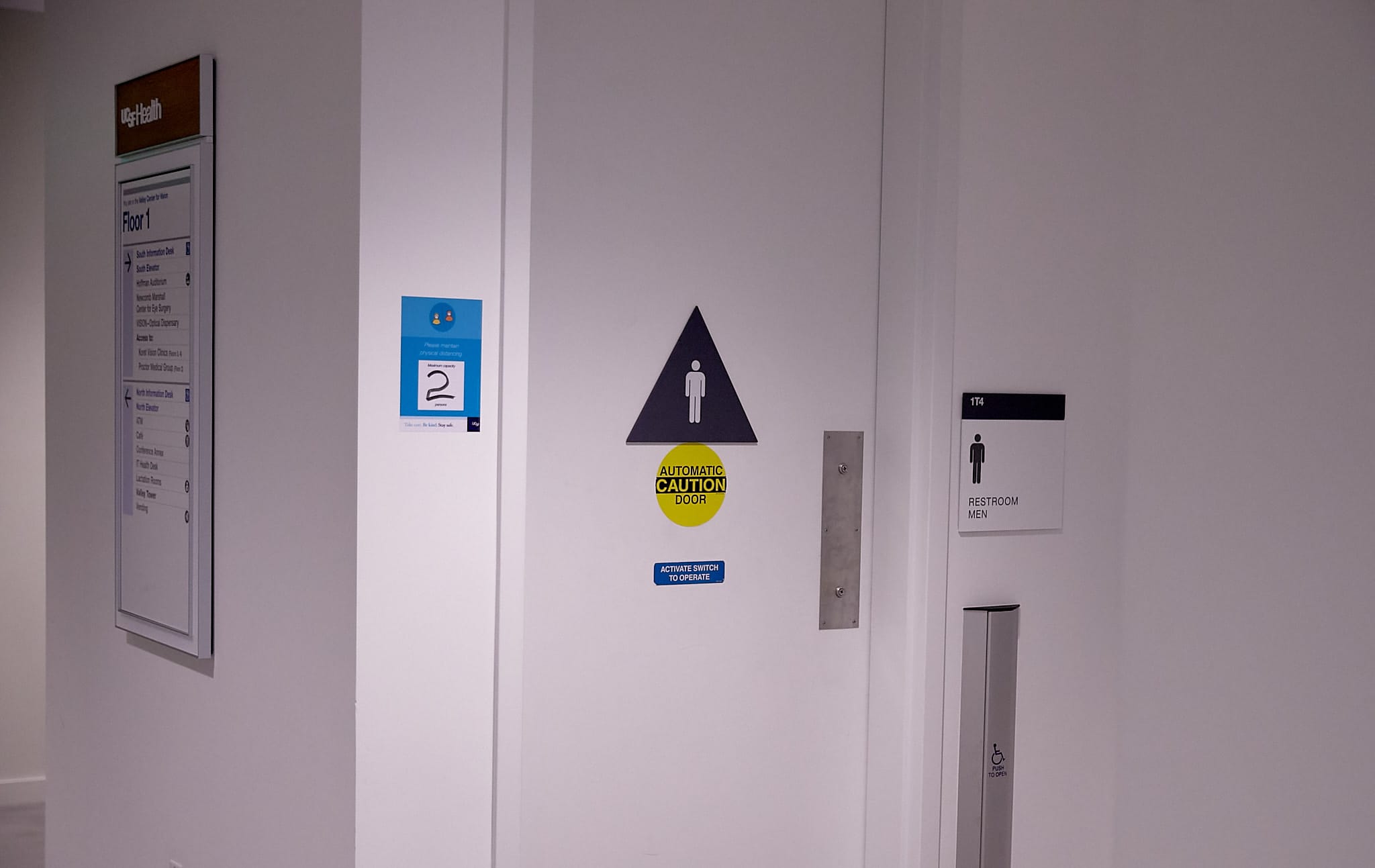
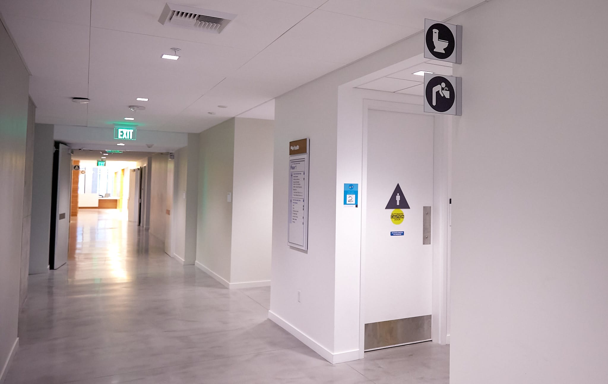
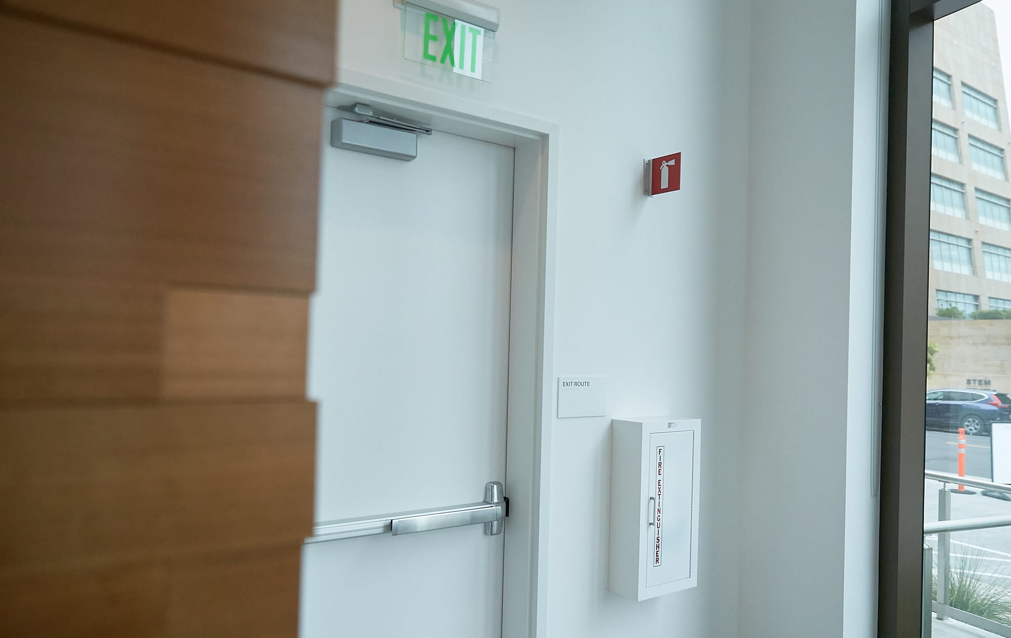
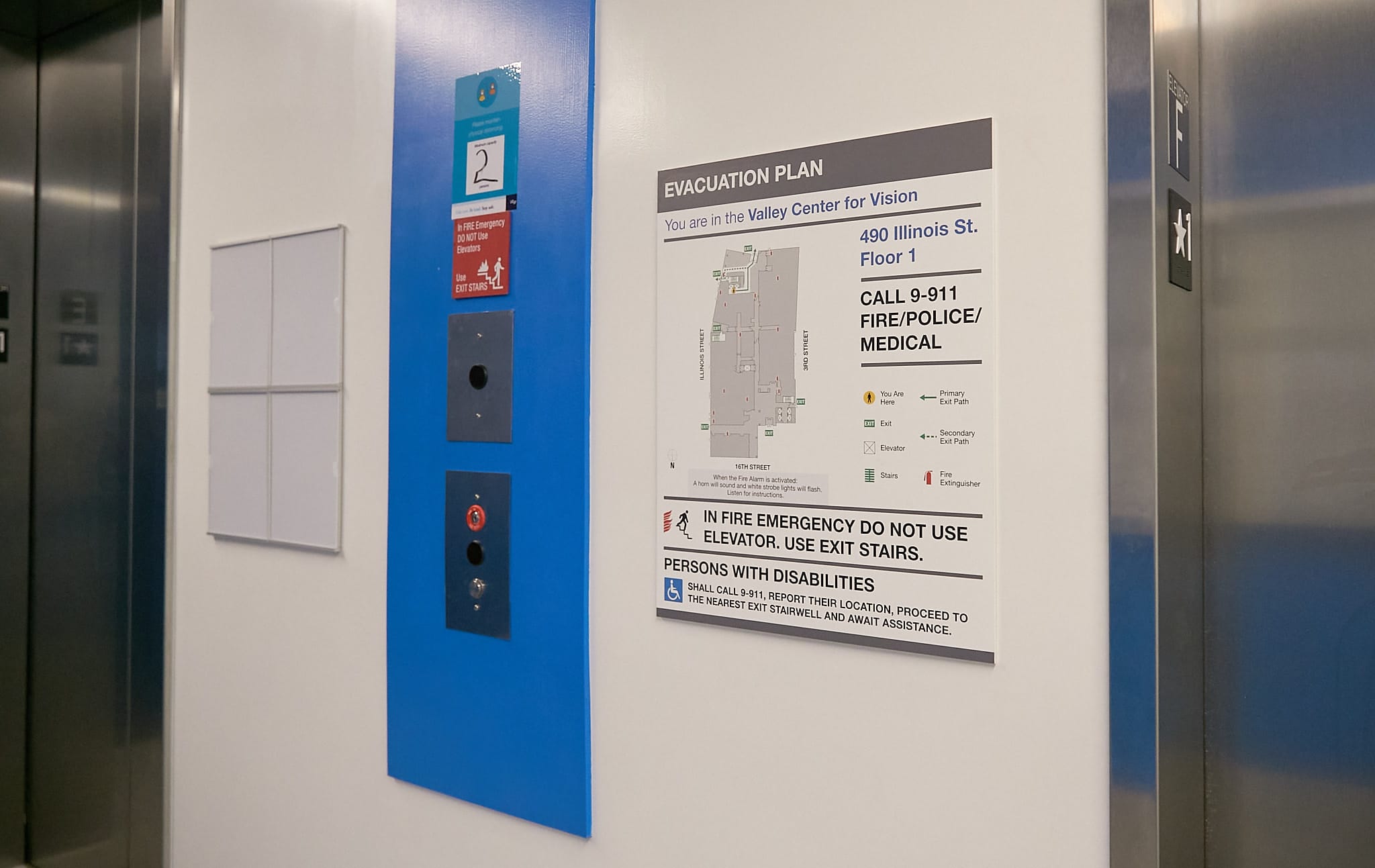
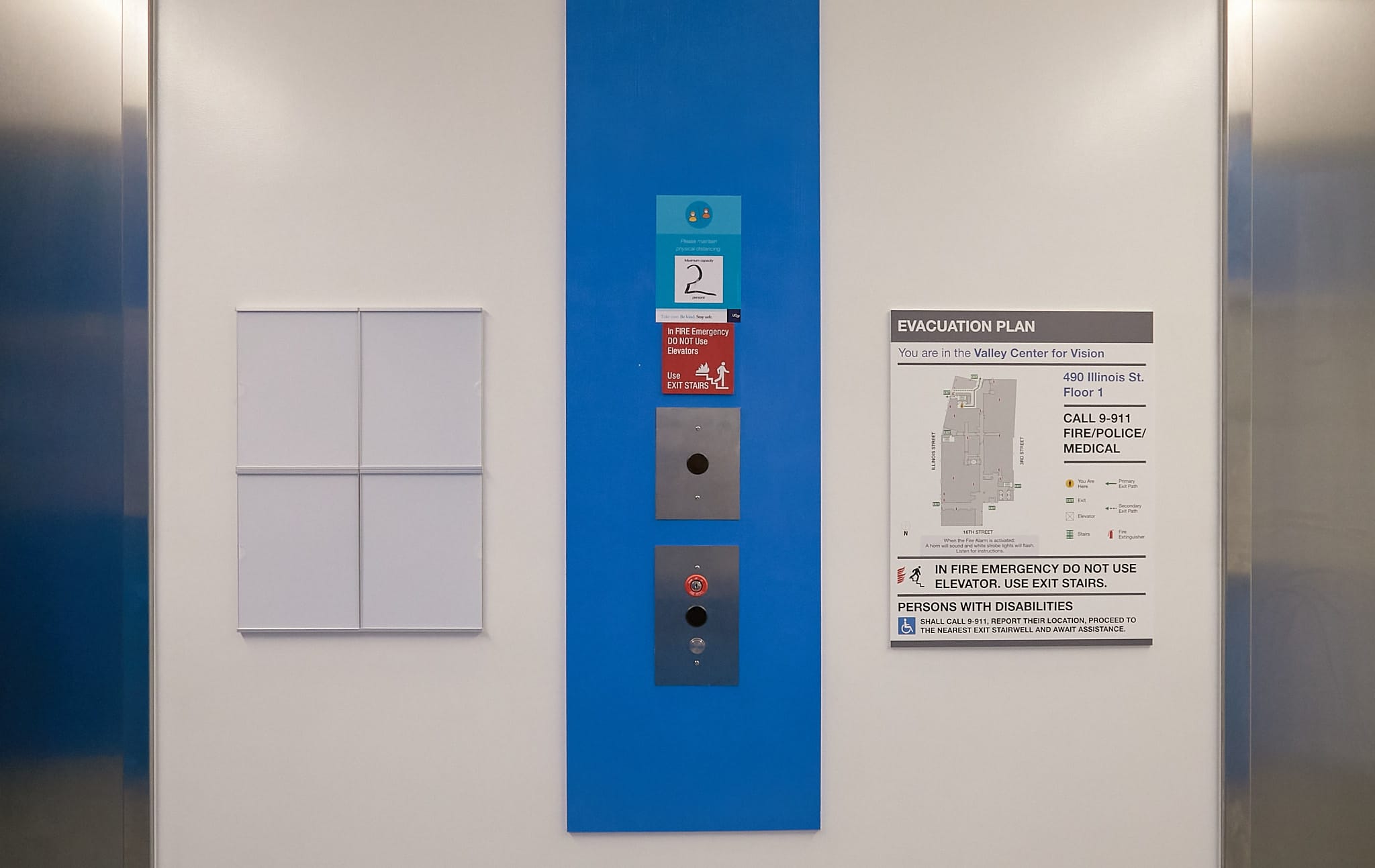
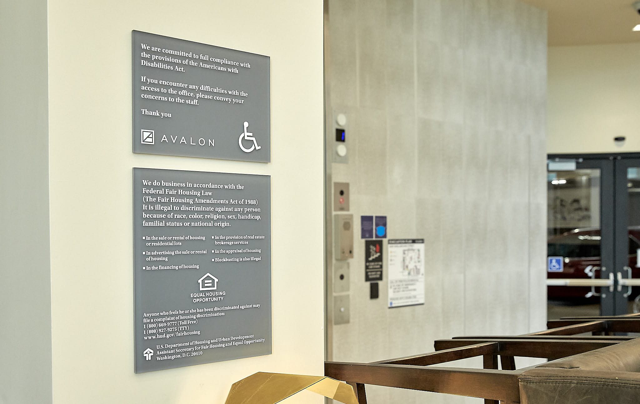
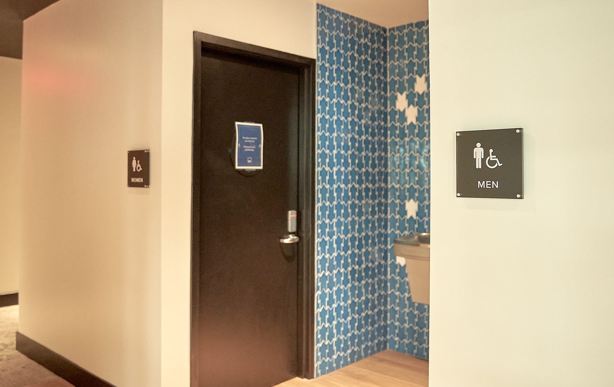
The Americans with Disabilities Act (ADA) has established standards for designing signage that enables persons with a sensory disability to read and understand them. ADA compliant signs in public spaces must include a pictogram, tactile text, Braille, or a combination of these to ensure that people with a disability can navigate the area easily and safely.
How Ad Art Does ADA Compliant Signs
Ad Art is all about value. We strive to be cost effective in everything we do so that every penny spent will bring optimal return on investment. Ad Art is known for creativity and innovation that helps set each customer’s sign apart from “ordinary” static signage. Quality, durability, and reliability are hallmarks of our products, which drives us to take pride in our work. We look good when our customers look good.
Below are some of the relevant ADA regulations and best practices Ad Art follows when designing, fabricating, and installing an ADA sign:
- ADA signs must have a high contrast ratio as well as a non-glare finish.
- Text characters in ADA signage must be in a clearly distinguishable sans serif or serif font, which is not in italics, and is not condensed or extra bold.
- Signs that mark or identify a public area or space should be created in Grade 2 Braille, which enables a person with visual disability to read it as fully integrated words.
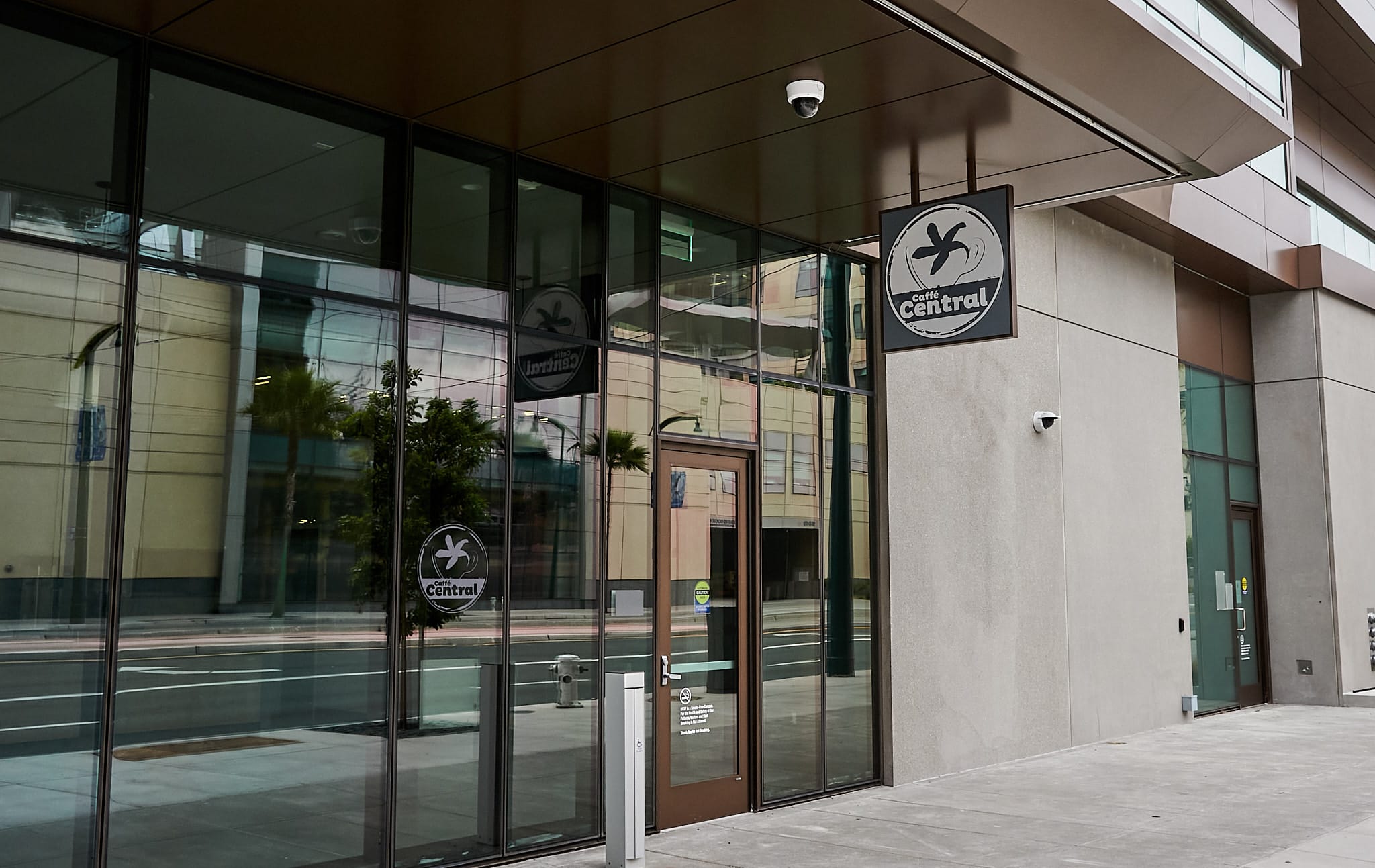
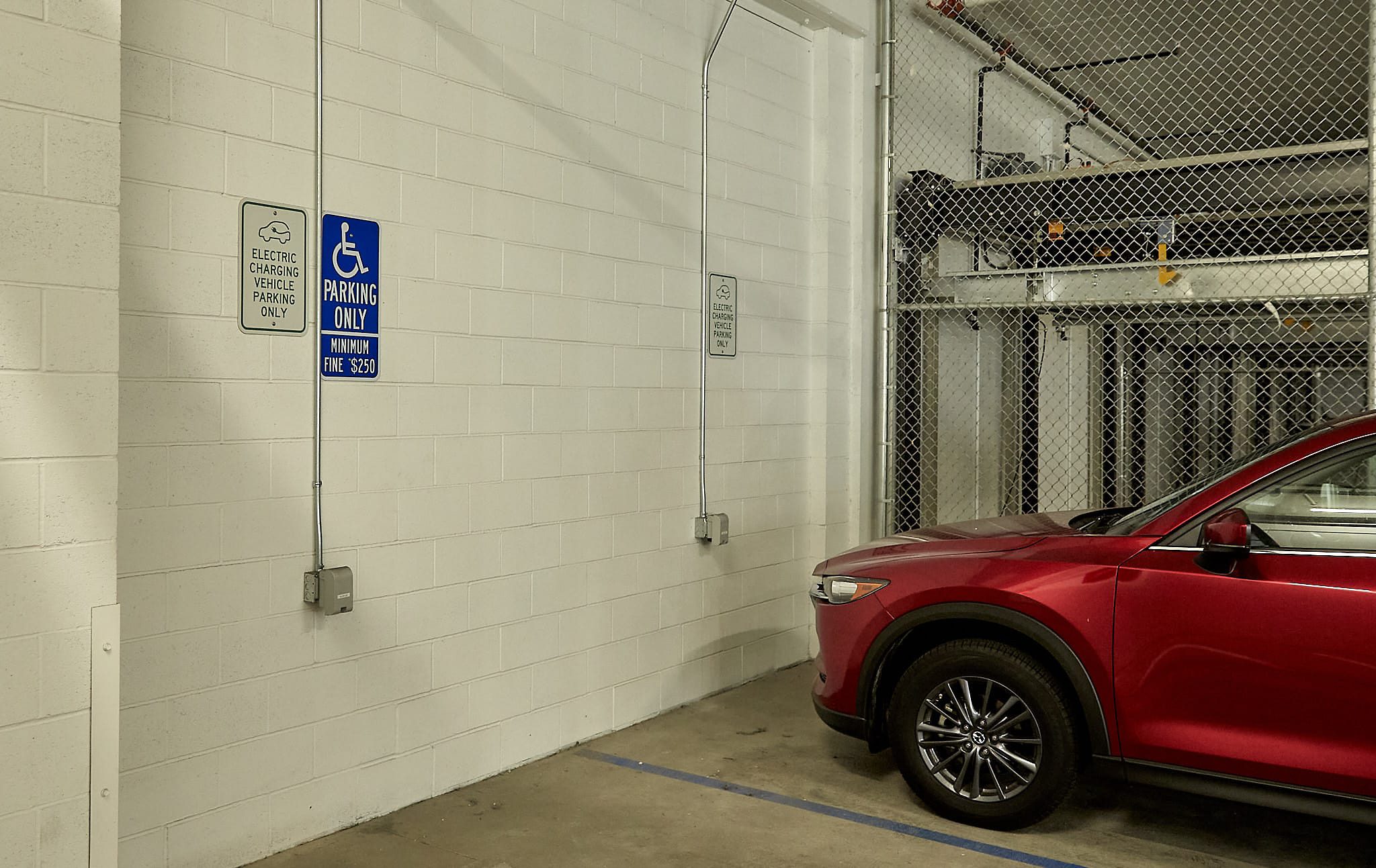
- Where applicable, the ADA compliant sign must include the appropriate pictogram, such as, a symbol for stairs or restroom, wheelchair, etc.
- The letter size must range between 5/8 of an inch and 2 inches in terms of height.
- The sign’s tactile characters must be at a height of 48 to 60 inches from the ground (measured from the base of the characters).
- Ad Art’s best practice “high contrast ratio” is to maintain at least 75 LRV (light reflectance value) or higher between the background and content.
- Ad Art’s best practice in low-lit areas is to create a sign with a dark background and bright content to improve visibility.
- Overhead signage is ideally repeated at eye level.
- Uniformity in textures, colors and text are maintained to further assist people.
- Care is taken to ensure lighting shadows do not interfere with visibility when a sign is hung.